Insharior: UX Case Study & Design Process
Interior item sharing application

Overview
Insharior is a peer-to-peer platform that lets young people in South Korea-especially one-person households in their early twenties-share interior items at low cost. This audience moves home every 1–2 years for work or financial reasons, which makes it impractical to invest in expensive furniture or to carry it along. We wanted to give them a trustworthy way to share interior items they no longer need at an affordable price.
Problems
- A sharp rise in young one-person households who increasingly want to decorate their own space with unique interior items.
- Frequent moves driven by economic constraints make it hard to transport heavy furniture like beds or couches, or to accumulate interior items at all.
- Growing interest in self-styled interiors among one-person households-even when they need to relocate often.

Based on these problems, we decided to build an application that addresses the need by providing a trusted, low-cost platform for sharing interior items-Insharior.
Challenge - Threats
- Many self-interior apps already exist on the App Store and Google Play in South Korea.
- Companies like IKEA and Hanssem already provide affordable furniture through offline channels.
- Lack of expertise and trust-the central challenge of the sharing economy. Users can easily doubt lenders or item quality.
How we solved it
- Beyond know-how about self-interior, we provide a platform to share furniture with trust, so users can earn money or discover unique items from others.
- SNS integration (Facebook, Instagram) lets users post photos of their rooms and keeps DAU healthy among our young target audience.
- Authentication via SNS and phone number builds trust between users.
- By collecting and analyzing user taste from search patterns and onboarding answers, we can show personalized products via the chatbot or main screen.
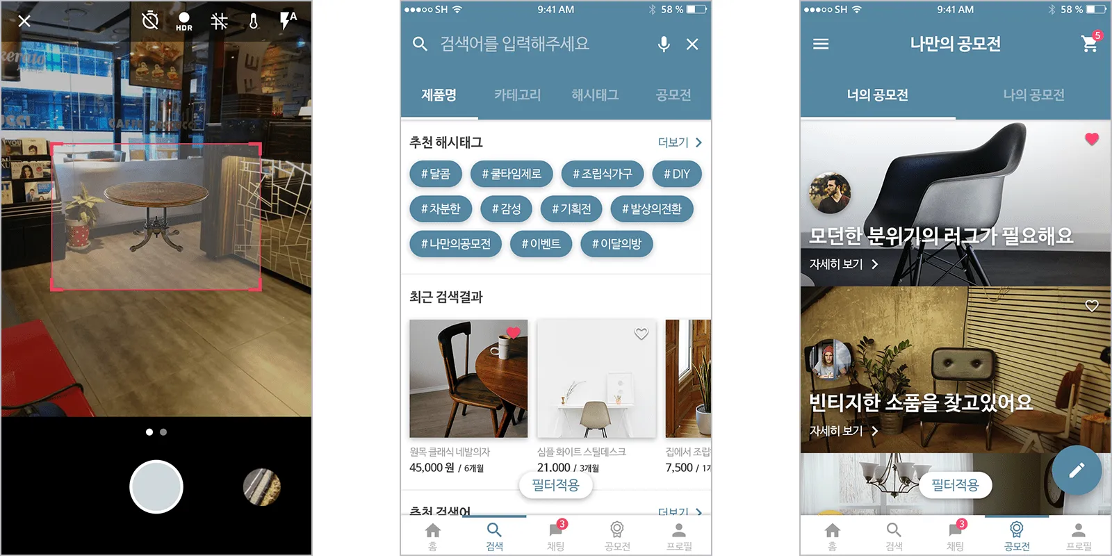
- An augmented reality feature lets users place furniture in their room before renting it.

#1. Observation
Audience
Insharior's main audience is people in their early twenties in South Korea. Due to economic and occupational circumstances, moving every 1–2 years is common-the biggest reason they cannot invest in interior items or expensive housewares.
Audience - Lifestyle
- Spend most of their time in a small rented room.
- Strong desire for self-expression on SNS.
- Short-term residency (typically 1–2 years).
- Discover interior trends through SNS or TV.
- Willing to make a reasonable investment in their living space.

Persona
We created personas to validate the concept with concrete examples. The image below shows one of Insharior's potential users. More personas (in Korean) on Google Drive - Persona 1, 2 | Persona 3

What they say
- "It's hard to decorate my room because I move so often. It's a real economic burden."
- "I don't have much money, but I want to decorate my own room like the ones I see on Instagram."
- "It feels wasteful to buy new interior items every time I move."
#2. Ideation
"What if we could get a luxury-looking interior item-like the ones on department store displays-at convenience-store prices?"
From the audience
Based on these insights, we set three core concepts for Insharior. We wanted users to be able to:
- Earn money from interior items they no longer use.
- Rent unique interior items from other users at low prices.
- Integrate with other SNS platforms to share their interior.

Platform
Insharior is a sharing-economy application: users share interior items with each other, and we provide the platform with a clean, intuitive interface. Integration with Facebook, Instagram, and Twitter is supported, and the user-facing view is personalized using data collected through the chatbot and analytics. Sharing-economy services like Airbnb, Uber, Lyft, and SolarCity have shown the model's strength-they don't own the inventory, only the platform, yet generate world-class returns.
"The share economy blows up the industrial model of companies owning and people consuming." - Forbes
Job stories
I wrote job stories to define our service as a better platform for users, lenders, and renters to interact with each other.
- When I move into a new empty rented place, I want to rent interior items and furniture at a low cost, so I can save money while still creating a nice room.
- When I have to move soon, I want to lend out my heavy items, so I can earn money instead of throwing them away.
- When I move into a new place, I want to see how others have decorated their homes, so I can style my room better and share it.

Structure map
Based on the concepts, ideas, and job stories above, we built this user flow before starting on wireframes-to validate the plan and create a strong foundation. From this user flow, I started building lo-fi wireframes and prototypes.

Product recommendation map
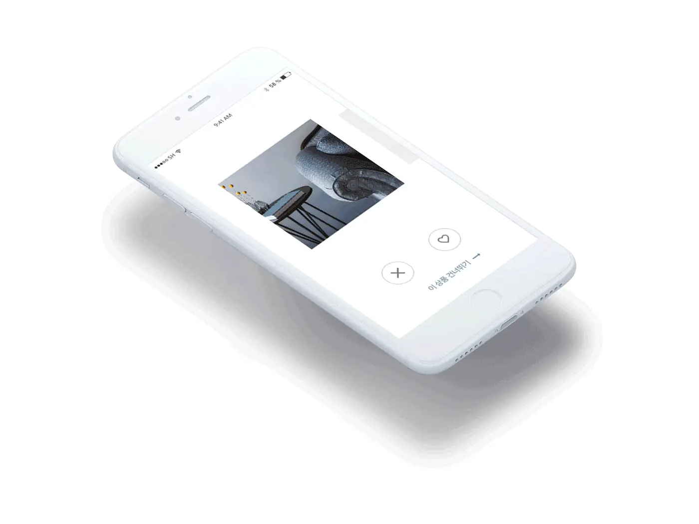
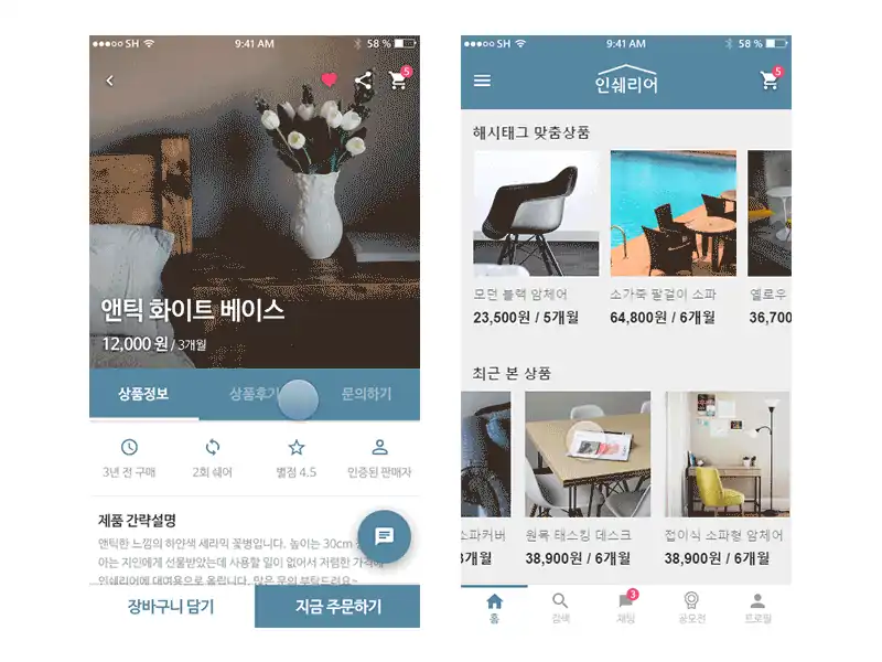
Showing users the right products based on their taste is critical to driving engagement and sales. We capture user taste at the very first launch (see the GIF at #4) and continue learning from saved products, hashtags, and search history. With this personalized data, Insharior can recommend tailored products on the main screen or through the chatbot.


#3. Rapid Prototyping
Lo-fi hand sketches

To validate concepts early, I sketched rough black-and-white wireframes by hand. From these, we iteratively developed the interface design.
Lo-fi wireframes
Before user testing, we built rough wireframes.

We ran user tests with classmates and college students using these wireframes, collecting feedback and opinions to improve the interface and experience.
#4. User Feedback
We built Hi-fi prototypes from the wireframes above and incorporated tester feedback to ensure the design was grounded in real user input.
Pain points & improvements
We surfaced several pain points during user testing-some of them critical for both users and Insharior-and redesigned each based on user feedback.

Pain Point #1: On the "Analyze your taste" screen, users could not tell how many steps were left, and there was no way to skip the process. We added a step indicator and a Skip / Finish button.

Pain Point #2: On the "Upload item for lend or sell" screen, users who didn't know an item's exact details (original price, material, purchase date) could not complete the form. We added an "Unknown" option for those fields.

Pain Point #3: On the "Checkout" screen, there was no way to select which items to actually purchase. We added a checkbox per item, an "Item details" button so users can review before confirming, and a total item count at the top.

Pain Point #4: When an error occurred during checkout, users had no way to know what went wrong. We added a description for each error so users can correct the form. We also added a "Save this information for faster checkout next time" checkbox.

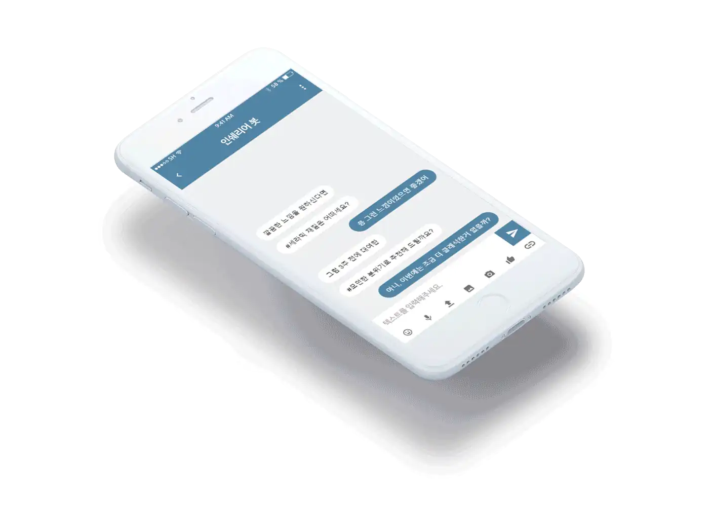
Chatbot
Insharior's chatbot recommends products based on collected signals (recently rented products, favorite hashtags, recently viewed items) and search patterns. Users can also use hashtags to find similar products through the chatbot.
#5. Validation & Iteration
With the improved interfaces, we ran additional rounds of user testing to validate the design. The chart below summarizes the results: if a tester completed a mission (a former pain point) without trouble, it was marked as a Success.

#6. Final Output
You can see the full design on Behance. The project was curated in the Interaction and Adobe XD galleries on Behance. I created animated GIFs in ProtoPie to communicate micro-interactions.


What I learned
It is easy to overlook critical components even when we know they matter. User testing is one of the best safeguards: by watching different people use a prototype, we surface unexpected issues and discover better directions.
Repeating cycles of testing, implementation, and improvement makes a design more solid and user-friendly. Issues missed in the first round surface in the second; even after we believe the design is satisfactory, the fifth round may reveal smaller problems. Through these cycles, we arrive at a more robust, user-centered design.
Takeaways
Insharior is a platform for early-twenties one-person households in South Korea. We hope it gives them a new way to acquire unique interior items at a low cost, and, at the same time, to earn money and reclaim space by lending out items they no longer need.
Thanks for reading.

See the full Insharior design on Behance.

Title : Insharior: UX Case Study & Design Process
Date : June 6, 2017 (6 Weeks)
Tools : Adobe XD, Adobe Photoshop, Adobe Illustrator, Xtensio, Studio XID ProtoPie
Designers :
Hyouk Seo (Spemer) - Persona/Storytelling, Ideation, Concept sketch, Lo-fi & Hi-fi prototyping, UI Design, Usability Testing, Wireframing, Information Architecture, Chatbot flow, Validation, Structure map, Interaction design
Gyuhyung Han - Wireframing, Lo-fi prototyping, Storytelling, Competitive analysis
Heegeun Oh - Ideation, Concept sketch, Project management, Persona, Presentation, User flow, Content curation, Lo-fi prototyping, Competitive analysis
Jeonggwan Kim - Persona, Ideation, Concept sketch, Content curation
Jian Hong - Persona, Ideation, Presentation, Logo design
Read the full case study on Medium
See the full design on Behance
Read the Insharior interview on Facebook (in Korean)