Does Material Design make designers 'non-creative'?

Material Design is rooted in physical theories from the real world, so it feels more natural and realistic than typical flat-design interfaces. It ships an enormous library of guidelines, patterns, icons, and color palettes-the so-called "Material Palette." All a designer has to do is follow the strict guidelines, mix and match Material components, and arrange the layout.
So what's the problem? Google already provides plenty of design elements-styles, motion, patterns. Paradoxically, those well-detailed guidelines are the most critical issue for us interface designers.

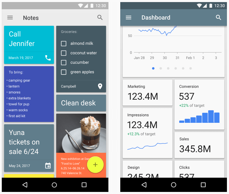
Material Design is genuinely good. It's clean, intuitive, and covers Android devices well. The problem is that designers have come to rely on it too much. Many Android applications are built directly on Material Design's guidelines, and the result often looks factory-produced-even though Material is one of the most detailed and usable design systems out there.

Material Design-made by Google and tightly coupled with Google products-can lead to a lack of individuality. Many Android apps on Google Play look strikingly similar. They follow the Material guidelines faithfully, and that very fidelity kills design creativity. Why?
There are tons of Android apps with their own purposes, unique experiences, and special needs. The problem is in their appearance-they all conform too closely to Material Design.
Designers reuse the same Material UI components, apply similar layouts across very different apps, and either paint them in the same Material palette or in arbitrary colors that don't really fit. Material icons are nice, but they can be made more unique or optimized for the product's own context.
There are countless free Material UI kits with thousands of stars. Search "Android" or "Material" on Dribbble or Google and you'll find Material Design samples by the truckload.

Material Design defines every detail from A to Z. Designers love it because the system is well thought out, well documented, and easy to learn. We can keep following its guidelines-but not 100%. Each application has its own purpose. When usability comes first, appearance can't be locked into a single guideline like Material Design. We have to optimize for each application's individuality.
We can keep the fundamentals of Material Design-layered depth, physical principles, lighting-and build more concrete, valuable experiences on top of them.
We can customize fonts, icons, colors, and components without fully following Material's guidelines. Creativity is the most important part of our job. As UI designers, we have a duty to develop, customize, and optimize at the front line of every trend. Use Material Design appropriately, but don't fully rely on it.
Title : Does Material Design make designers 'non-creative'?
Date : August 3, 2017
Writer : Hyouk Seo (Spemer)